What is a heatmap?
A heatmap is a tool that uses color to graphically represent complex data, making it easier to visualize and understand.
With Neurons AI, you can generate multiple types of AI-predicted heatmaps:
Legacy heatmaps
Tip: Use Areas of Interest (AOIs) to quantify the heatmaps by measuring the impact of different areas or elements in your images!
 Attention Heatmaps

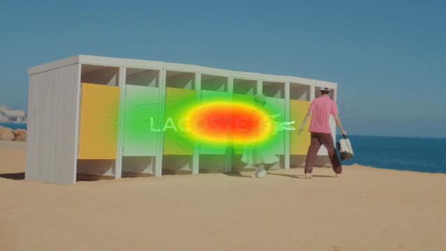
Attention heatmaps show which areas are most likely to catch people’s eyes when they see an image or a video.
The color range from green through yellow to red indicates the cumulative time of eye fixations to each region of an image or video. Warmer colors indicate more attention.
Tip: Use Areas of Interest (AOIs) to quantify the amount of attention in different areas of your images!
 Attention Fogmaps
Based on the same data as the Attention Heatmap, and is also referred to as a “reversed heatmap.” Instead of adding color to the image/video where attention is present, it instead covers the image/video with a white fog and then clears that fog based on the amount of attention.
Tip: The Fogmap is great for spotting small amounts of attention (visualized in the heatmap as green) on colorful and especially green backgrounds.
Note: If you can’t see something on the fogmap, it’s because people won’t see it either!
 Cognitive Demand Heatmaps
The Cognitive Demand score is a measure of visual complexity and, therefore, characterises the amount of information in an image that a customer has to process. The Cognitive Demand heatmap helps customers understand what elements are contributing most significantly to the Cognitive Demand score, thereby providing some clear guidelines on how to reduce the Cognitive Demand (if necessary or desired). In essence, the red and green regions correspond to high and low complexity areas, respectively.
 Engagement Heatmaps
The Engagement heatmap illustrates the areas of the image that contribute most and least to the overall Engagement Score.
This heatmap is a visualization of how the Neurons AI model determined the predicted score. The regions that influence the score most heavily are colored green, and conversely, the red regions have the least impact on the score.
This means that elements in the green areas contribute the most to the positive emotional response of the viewers, whereas red areas will feel less emotionally engaging.
Available for image predictions only.

 Memory Heatmaps
Much like the Engagement map, the memory heatmap shows which elements in the image contribute most to the Memory score. Green areas represent greater contribution to the memorability of the asset and the potential for recalling the asset by viewers.
Available for image predictions only.
Legacy Heatmaps
 Clarity Heatmaps
The Clarity heatmap illustrates the areas of the image that contribute most and least to the overall Clarity score.
Essentially, this heatmap is a visualization of how the Neurons AI model determined the predicted score. The regions that influence the score most heavily are colored green, and conversely, the red regions have the least impact on the score.
As such, customers will experience green areas as very clear, and elements in red areas will be perceived to be unclear.
Currently only available for image predictions.
 Engagement Heatmaps
The Engagement heatmap is created in the same way as the Clarity heatmap, as it is also a visualization of how the Neurons AI model predicted the overall Engagement score. The green regions contribute the most to the overall score, and the red regions contribute the least.
This means that elements in the green areas will make customers feel more immersed, whereas red areas will feel less engaging.
Currently only available for image predictions.